
Outdoor Signage Design: Why Most Signs Get Ignored (and How to Fix It)
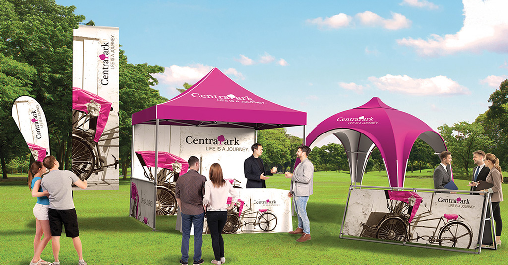
Signage is one of the fastest ways to capture your customers’ attention, but only if it’s designed to be seen.
As spring events, promotions, and outdoor traffic pick up, signage becomes a go-to tool for reaching customers in high-visibility moments.
But is it working?
The reality is that far too much signage gets ignored because it’s often designed without considering how people actually see and interact with it in the real world.
People don’t stop and study signs. They glance. They scan. They move on.
Think about the last several yard signs or billboards you passed while driving. How many do you remember?
Chances are, you’ve seen many of them crammed with text or designed with poor color contrasts that don’t convey their messages in the two to three seconds you have to look at them.
That’s exactly the problem.
Business owners invest a lot in signage, and when designed the right way, it absolutely works to drive in customers. But done poorly, it gets ignored, or worse, turns buyers away from your brand.
We’re here to help you avoid the most common design mistakes and get more out of your signage investment. Let’s talk design!
Topics
Why Most Signage Gets Ignored
The 3 Most Common Signage Mistakes
How Big Should Your Sign Text Be?
5 Tips for High-Visibility Signage
Types of Signage for Events, Promotions, and Storefronts#
When to Invest in Professional Signage
Frequently Asked Questions About Signage Design
Signage Solutions That Drive Visibility
Why Most Signage Gets Ignored
Think about how you interact with signage in your daily life.
Whether you’re walking through a busy downtown area, driving past storefronts, or attending an event, you’re constantly surrounded by visual information competing for your attention.
Your brain filters most of it out automatically.
That means your signage isn’t just competing with other signs. It’s also competing with everything else:
- Traffic
- Buildings
- People
- Digital screens
- Environmental distractions
If your sign doesn’t immediately stand out and communicate clearly, it disappears into the background.
The key to effective signage is being instantly understood.
The 3 Most Common Signage Mistakes
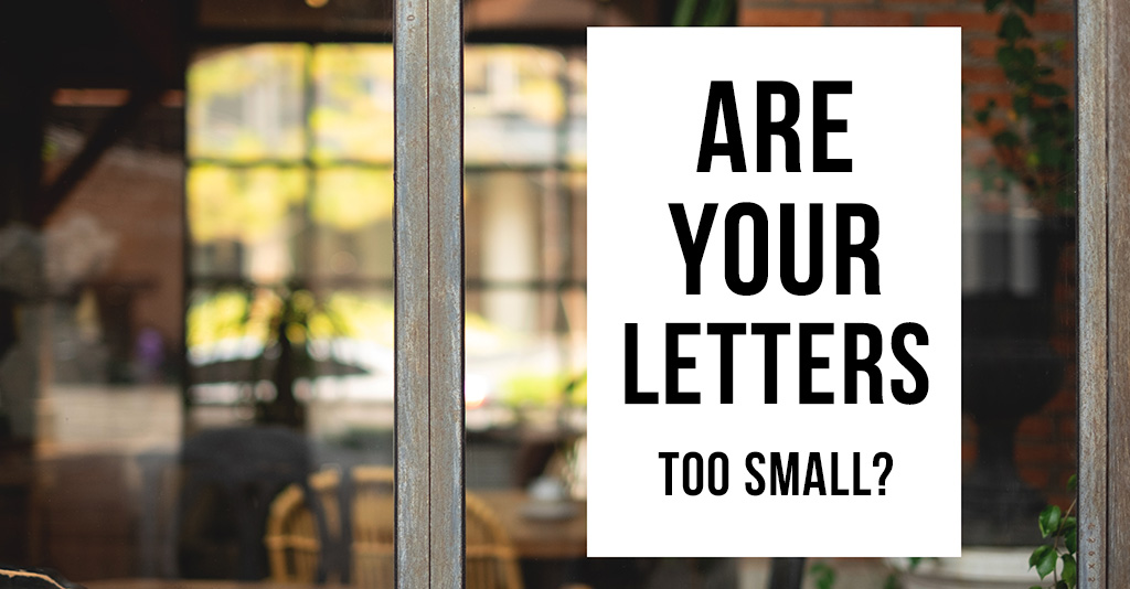
1. Text That’s Too Small to Read
This is perhaps the most common, and most costly, mistake.
If people can’t read your sign from the intended viewing distance, it fails before it even has a chance to work.
Businesses often prioritize design over readability, choosing smaller text to fit in more information or maintain a certain aesthetic.
But in signage, clarity always wins because you have limited space and time to deliver your message.
A sign should be readable at a glance, from the distance it’s meant to be seen, and not just up close.
2. Choosing the Wrong Material
Not all signage materials are created equal.
Outdoor signs are exposed to:
- Sunlight (UV fading)
- Wind and weather
- Temperature changes
- Moisture and wear
Using the wrong material can result in signage that fades, tears, or deteriorates quickly, hurting both visibility and brand perception.
The key is matching the material to how and where the sign will be used:
- Vinyl banners are great for flexibility and affordability
- Corrugated plastic works well for yard signs
- Aluminum offers long-term durability for permanent signage
Choosing the right material ensures your investment lasts and continues to perform.
3. No Clear Message or Call-to-Action
This is a big one that we see far too often. Even if your sign is visible and durable, it still needs to communicate effectively.
One of the biggest missed opportunities in signage is failing to include a clear, actionable message.
Your audience should immediately understand:
- What you’re offering
- Who it’s for
- What they should do next
Without a clear call-to-action, even a well-designed sign won’t drive the results you’re looking for.
How Big Should Your Sign Text Be?
One of the most important factors in signage is text size. A simple and widely used rule of thumb is:
1 inch of letter height for every 10 feet of viewing distance
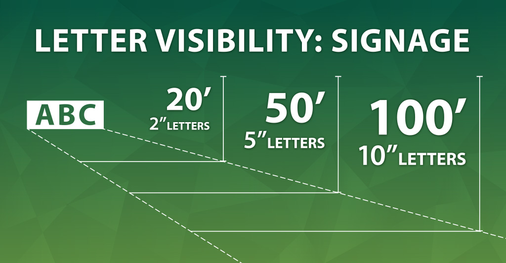
Example Guidelines:
- 20 feet away → 2” letters
- 50 feet away → 5” letters
- 100 feet away → 10” letters
This guideline helps ensure your message is readable from the intended distance.
However, context matters.
If your audience is:
- Driving: Increase size significantly
- Walking: Standard sizing may be sufficient
- Indoors: You may have more flexibility
Speed of movement directly impacts readability. The faster someone is moving, the larger and clearer your text needs to be for your customer to be able to absorb your message.
5 Tips for High-Visibility Signage
1 – Use High Contrast Colors
Contrast is one of the most important elements of readability.
Black on white, white on dark colors, and bold contrasting combinations are easiest to read quickly.
Low-contrast designs may look subtle, but they’re often ineffective at a distance.
2 – Choose Simple, Bold Fonts
Decorative fonts may look interesting up close, but they often become unreadable at scale or from a distance. Generally, it’s best to stick with:
- Clean sans-serif fonts
- Bold weights
- Simple letterforms
Clarity should always take priority over style.
3 – Keep Messaging Short and Focused
Your sign is not a brochure. It should communicate one primary message clearly and quickly.
A good rule of thumb is 5–7 words max for your primary messaging.
Trying to include too much information reduces the effectiveness of your message and overwhelms the viewer. Most people simply filter it out.
4 – Avoid ALL CAPS
While all caps may seem more visible, they can be harder to read quickly.
Title case or sentence case improves readability by giving words recognizable shapes.
5 – Design for Speed
Your signage should be understood within seconds. Ask yourself:
- Can someone understand this in 2–3 seconds?
- Is the message immediately clear?
- Is the next step obvious?
If not, simplify.
Types of Signage for Events, Promotions, and Storefronts
Choosing the right type of signage is just as important as designing it correctly.
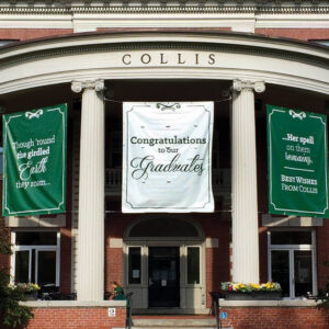
Custom Banners
Ideal for events, storefront promotions, and large-scale messaging. Offers affordable flexibility and strong visibility.
Learn More
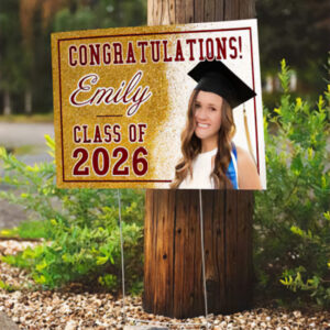
Yard Signs
Best for local campaigns, directional signage, and temporary promotions. Easy to deploy and effective in high traffic areas.
Learn More
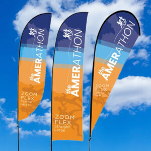
Feather Flags
Great for attracting attention, and outdoor visibility in crowded areas. Their movement naturally draws the eye.
Learn More

Trade Show Displays
Designed for exhibits, conferences, and premium brand visibility. Stand out against the other businesses in the room.
Learn More
When to Invest in Professional Signage
If your signage plays a role in representing your brand, driving traffic, or supporting sales or events, it’s worth doing right.
Professional signage isn’t just about printing – it’s about making sure every detail works together to capture your customers’ attention and communicate clearly.
Professional signage ensures:
- Proper sizing and readability
- High-quality materials
- Effective messaging
- Strong visual impact
Poor signage doesn’t just get ignored. It can reflect poorly on your brand.
That’s where working with an experienced team makes the difference. From concept and design to material selection and production, our team helps ensure your signage is built to perform in the real world where it matters most.
If you’re planning a project, we’re here to help you get it done right from the start.
Frequently Asked Questions About Signage Design
What is the best font for signage?
Simple, bold sans-serif fonts are typically the most readable and effective.
How far away should signage be readable?
Use the 10:1 rule but adjust based on speed and environment.
What materials last longest outdoors?
Aluminum, weather-resistant vinyl, and durable plastics are common long-lasting options.
How much text should a sign include?
As little as possible while still delivering a clear message and call-to-action.
Signage Solutions That Drive Visibility
If you’re planning signage for an upcoming event, promotion, or storefront, getting the details right makes all the difference.
From banners and yard signs to trade show displays and wide-format printing, the right materials and design can help your message stand out and get the results you’re looking for.
Contact us today to get started, and we’ll ensure your signage gets done right the first time.